#Introduction
Circular layout is very useful to represent complicated information.
it represents information with long axes or a large amount of categories;
it intuitively shows data with multiple tracks focusing on the same object;
it easily demonstrates relations between elements.
Gu, Z. (2014) circlize implements and enhances circular visualization in R. Bioinformatics. DOI: 10.1093/bioinformatics/btu393
Principles
A circular layout is composed of sectors and tracks.
The rule for making the circular plot is rather simple. It follows the sequence of initialize layout -> create track -> add graphics -> create track -> add graphics - … -> clear. Graphics can be added at any time as long as the tracks are created. Details are shown in Figure and as follows:

For data in different categories, they are allocated into different sectors and for multiple measurements of the same category, they are represented as stacked tracks from outside of the circle to the inside.
The intersection of a sector and a track is called a cell (or a grid, a panel), which is the basic unit in a circular layout. It is an imaginary plotting region for data points in a certain category.
circlize implements low-level graphic functions for adding graphics in the circular plotting regions, so that more complicated graphics can be easily generated by different combinations of low-level graphic functions.
| Function | Action |
|---|---|
circos.points() |
adds points in a cell. |
circos.lines() |
adds lines in a cell. |
circos.segments() |
adds segments in a cell. |
circos.rect() |
adds rectangles in a cell. |
circos.polygon() |
adds polygons in a cell. |
circos.text() |
adds text in a cell. |
circos.axis(), circos.yaxis() |
add axis in a cell. |
Following functions arrange the circular layout.
| Function | Action |
|---|---|
circos.initialize() |
allocates sectors on the circle. |
circos.track() |
creates plotting regions for cells in one single track. |
circos.update() |
updates an existed cell. |
circos.par() |
graphic parameters. |
circos.info() |
prints general parameters of current circular plot. |
circos.clear() |
resets graphic parameters and internal variables. |
A quick glance
Let’s generate some random data. There needs a character vector to represent categories, a numeric vector of x values and a vectoe of y values.
set.seed(123)

n = 1000

df = data.frame(
    factors = sample(letters[1:8], n, replace = TRUE)
  , x = rnorm(n)
  , y = runif(n)
  )

str(df)
## 'data.frame': 1000 obs. of 3 variables:
## $ factors: chr "g" "g" "c" "f" ...
## $ x : num -0.602 -0.994 1.027 0.751 -1.509 ...
## $ y : num 0.206 0.943 0.379 0.626 0.184 ...1.Intialization
First we initialize the circular layout.
The circle is split into sectors based on the data range on x-axes in each category.
df$x is split by df$factors and the width
of sectors are automatically calculated based on data ranges in each
category.
library(circlize)

circos.par("track.height" = 0.1)
circos.par("points.overflow.warning" = FALSE)

circos.initialize(factors = df$factors, x = df$x)
2.Adding tracks
After initialization, graphics can be added to the plot in a track-by-track manner.
All tracks should be first created by
circos.trackPlotRegion()or, for short,circos.track(), then the low-level functions can be added afterwards.
Just think in the base R graphic engine, you need first call
plot() then you can use functions such as
points() and lines() to add graphics. Here we
only need to specify the y ranges for each cell.
circos.track(
      factors = df$factors
    , y = df$y,
      panel.fun = function(x, y) {
        circos.text(CELL_META$xcenter,
                    CELL_META$cell.ylim[2] + uy(5, "mm"),
                    CELL_META$sector.index)
        # Adding Axes
        circos.axis(labels.cex = 0.6)
    }
)

col = rep(c("#FF0000", "#00FF00"), 4)

# Adding points
circos.trackPoints(df$factors, df$x, df$y, col = col, pch = 16, cex = 0.5)

# add sector name outside
circos.text(-1, 0.5, "text", sector.index = "a", track.index = 1)
## ========================================
## circlize version 0.4.15
## CRAN page: https://cran.r-project.org/package=circlize
## Github page: https://github.com/jokergoo/circlize
## Documentation: https://jokergoo.github.io/circlize_book/book/
##
## If you use it in published research, please cite:
## Gu, Z. circlize implements and enhances circular visualization
## in R. Bioinformatics 2014.
##
## This message can be suppressed by:
## suppressPackageStartupMessages(library(circlize))
## ========================================
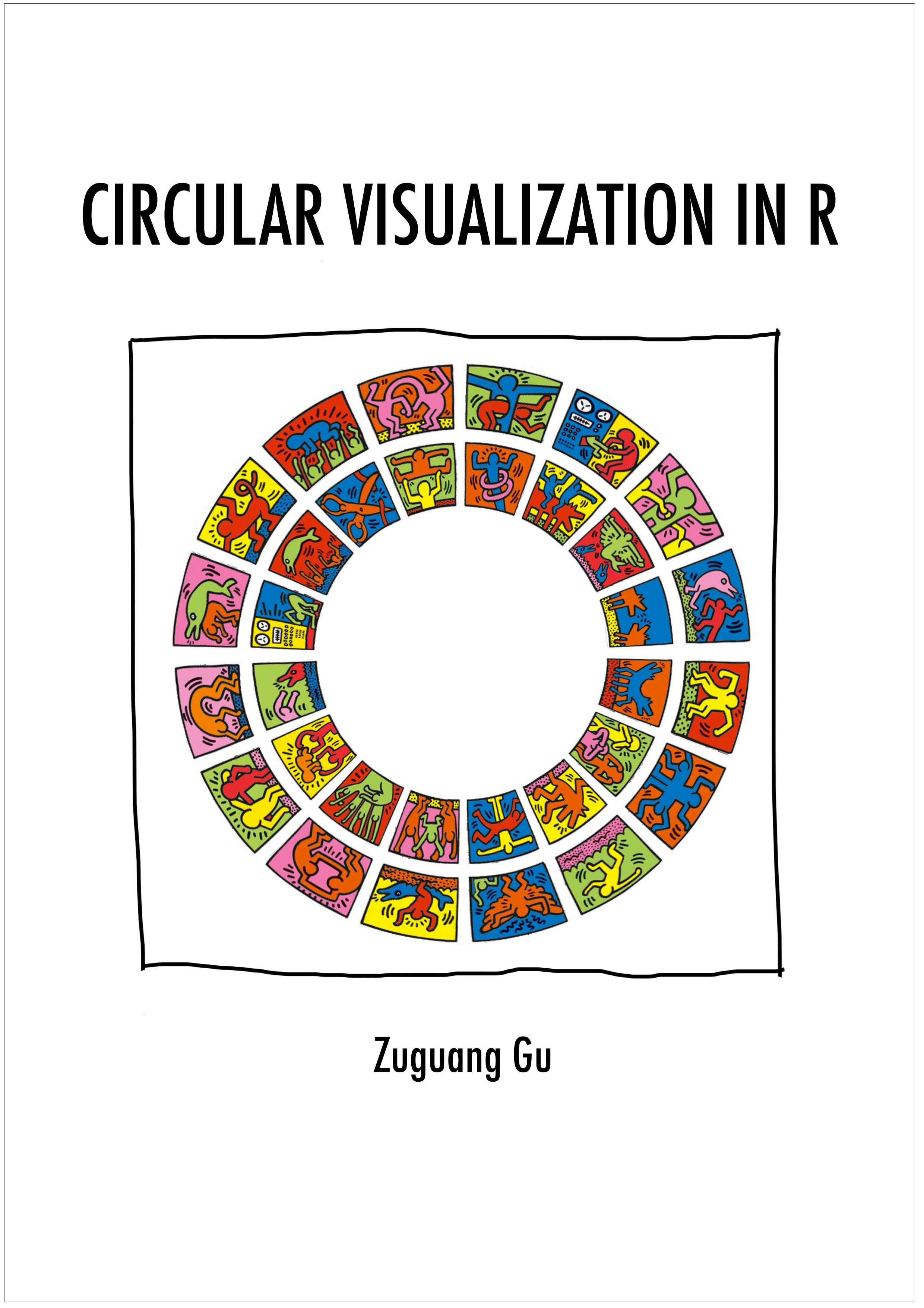
First example of circlize, add the first track.
circos.track()creates plotting region in a cell-by-cell manner.
Thus,
panel.funactually means adding graphics in the “current cell”
circos.axis()draws x-axes on the top of each cell (or the outside of each cell).
-circos.text() add sector name outside the first
track.
CELL_METAprovides “meta information” for the current cell. There are several parameters which can be retrieved byCELL_META.
When specifying the position of text on the y direction, an offset of
uy(5,"mm") is added to the y position of the text.
In
circos.text(), x and y values are measured in the data coordinate (the coordinate in cell), anduy()function (orux()which is measured on x direction) converts absolute units to corresponding values in data coordinate.circos.trackPoints()simply adds points in all cells simultaneously.
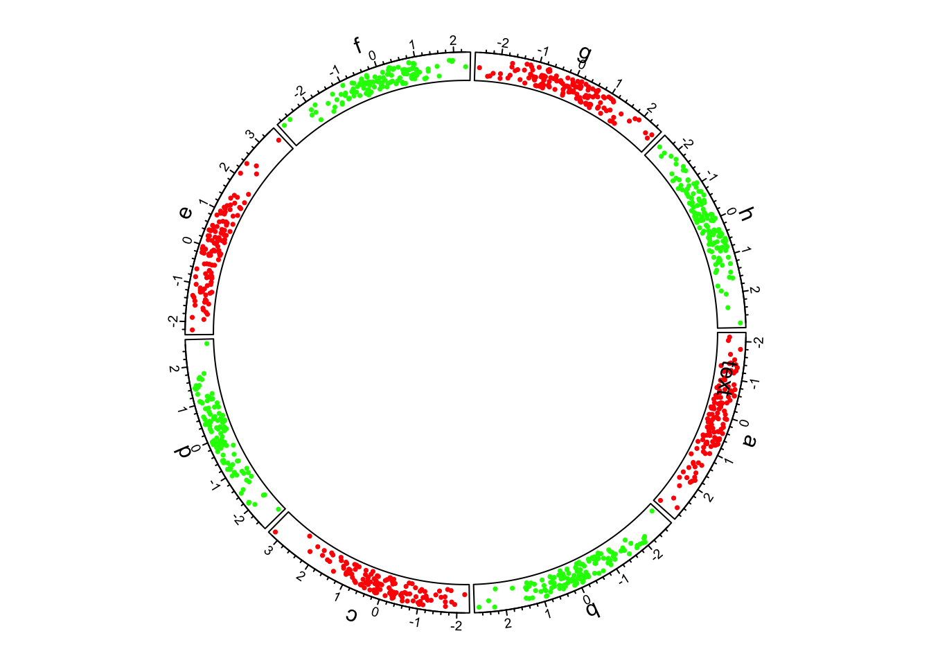
3.Histograms
circos.trackHist()is a high-level function which means it creates a new track.bin.sizeis explicitly set so that the bin size for histograms .
bgcol = rep(c("#EFEFEF", "#CCCCCC"), 4)
circos.trackHist(df$factors, df$x, bin.size = 0.2, bg.col = bgcol, col = NA)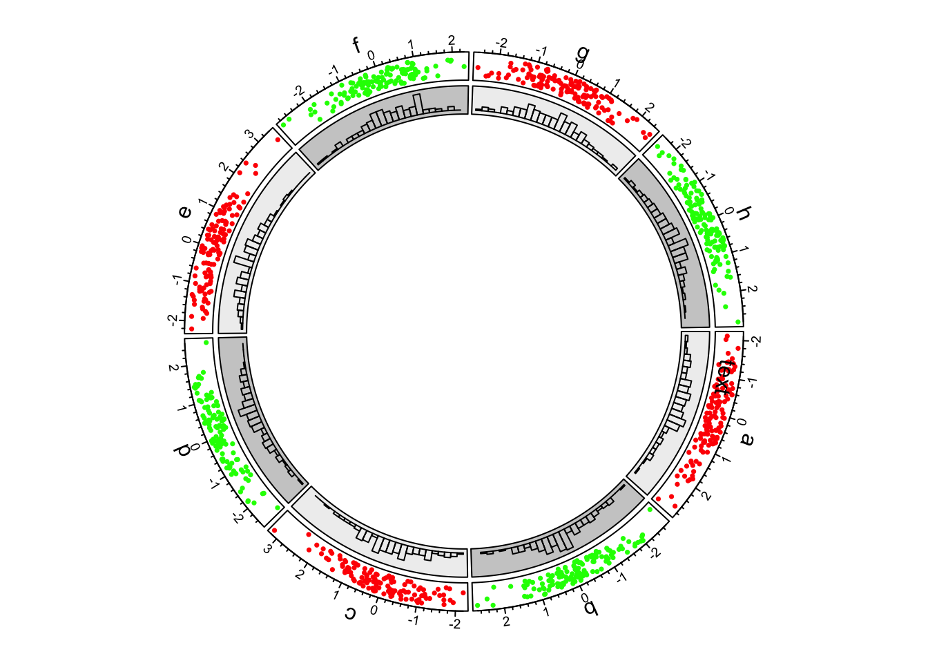
First example of circlize, add the second track.
4.Lines
In the third track and in panel.fun, we randomly picked
10 data points in each cell, sort them and connect them with lines.
In following code, when factors, x and
y arguments are set in circos.track(), x and y
values are split by df$factors and corresponding subset of
x and y values are sent to panel.fun through
panel.fun’s x and y arguments.
Thus, x and y in panel.fun are
exactly the values in the “current” cell.
circos.track(factors = df$factors, x = df$x, y = df$y,
    panel.fun = function(x, y) {
        ind = sample(length(x), 10)
        x2 = x[ind]
        y2 = y[ind]
        od = order(x2)

        circos.lines(x2[od], y2[od])

        })
First example of circlize, add the third track.
5.Updating sectors
Now we go back to the second track and update the cell in sector “d”.
-circos.update() erases graphics which have been added.
circos.update() can not modify the xlim and
ylim of the cell as well as other settings related to the
position of the cell. circos.update() needs to explicitly
specify the sector index and track index unless the “current” cell is
what you want to update. After the calling of
circos.update(), the “current” cell is redirected to the
cell you just specified and you can use low-level graphic functions to
add graphics directly into it.
circos.update(sector.index = "d"
              , track.index = 2
              , bg.col = "#FF8080"
              , bg.border = "black")

circos.points(x = -2:2, y = rep(0.5, 5), col = "white")

circos.text(CELL_META$xcenter, CELL_META$ycenter, "UPDATED", col = "white")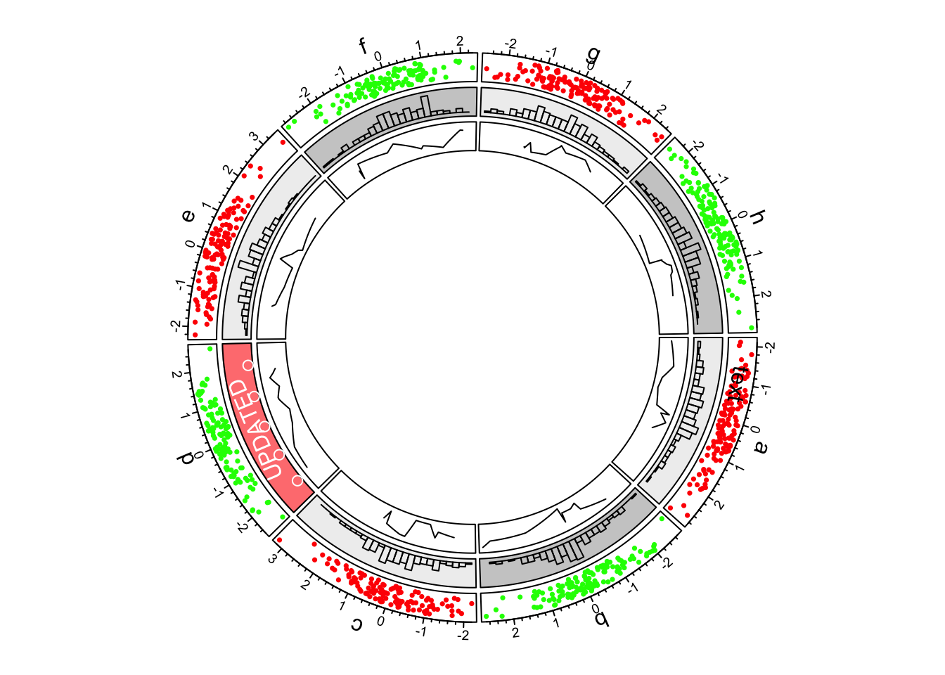
First example of circlize, update the second track.
6.Create a new track
Although we have gone back to the second track, when creating a new track, the new track is still created after the track which is most inside.
circos.track(ylim = c(0, 1), panel.fun = function(x, y) {
    xlim = CELL_META$xlim
    ylim = CELL_META$ylim
    breaks = seq(xlim[1], xlim[2], by = 0.1)
    n_breaks = length(breaks)
    circos.rect(breaks[-n_breaks], rep(ylim[1], n_breaks - 1),
                breaks[-1], rep(ylim[2], n_breaks - 1),
                col = rand_color(n_breaks), border = NA)
})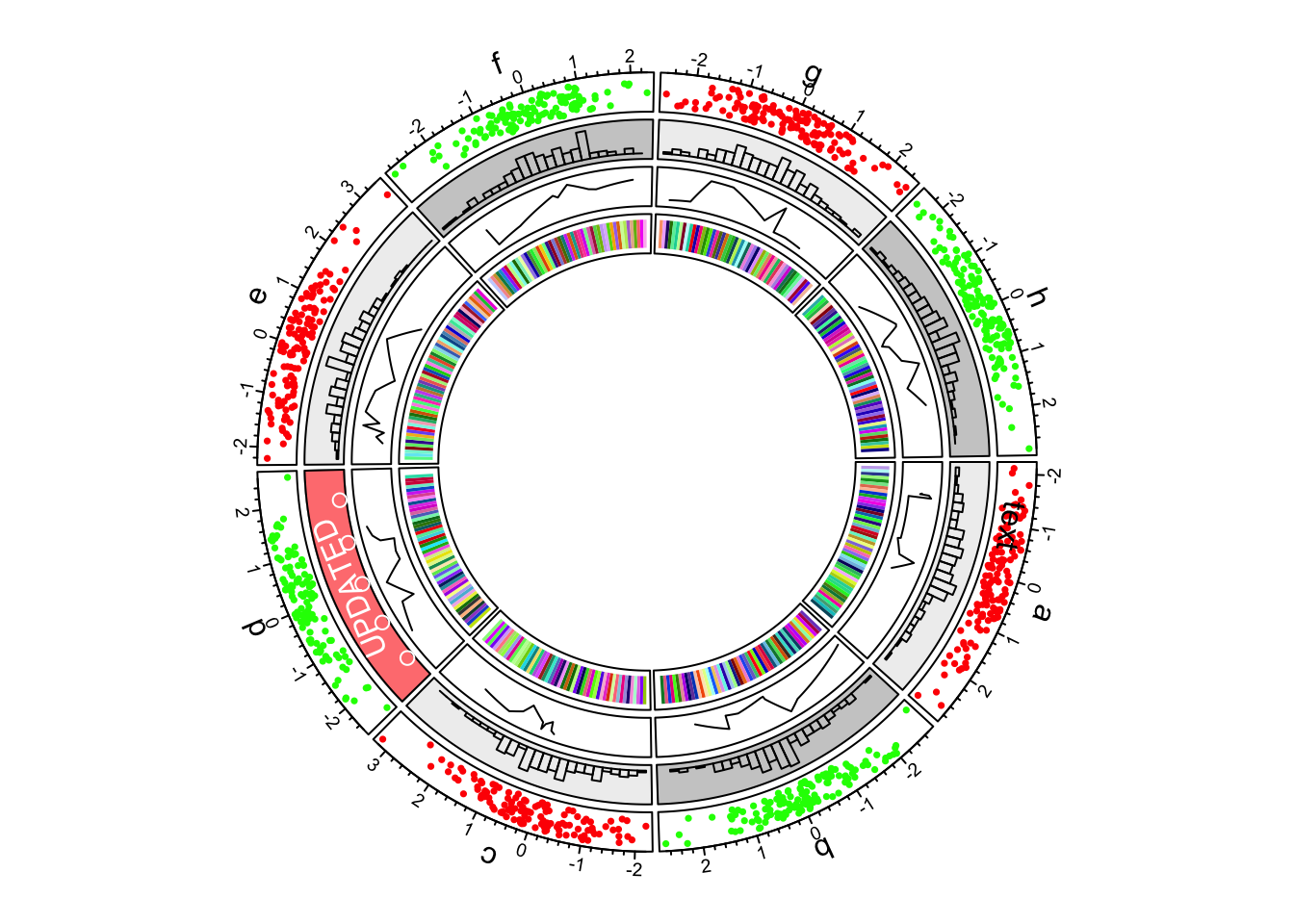
First example of circlize, add the fourth track.
7.Links
In the most inside of the circle, links or ribbons are added. There can be links from single point to point, point to interval or interval to interval.
circos.link("a", 0, "b", 0, h = 0.4)

circos.link("c", c(-0.5, 0.5), "d", c(-0.5,0.5), col = "red", border = "blue", h = 0.2)

circos.link("e", 0, "g", c(-1,1), col = "green", border = "black", lwd = 2, lty = 2)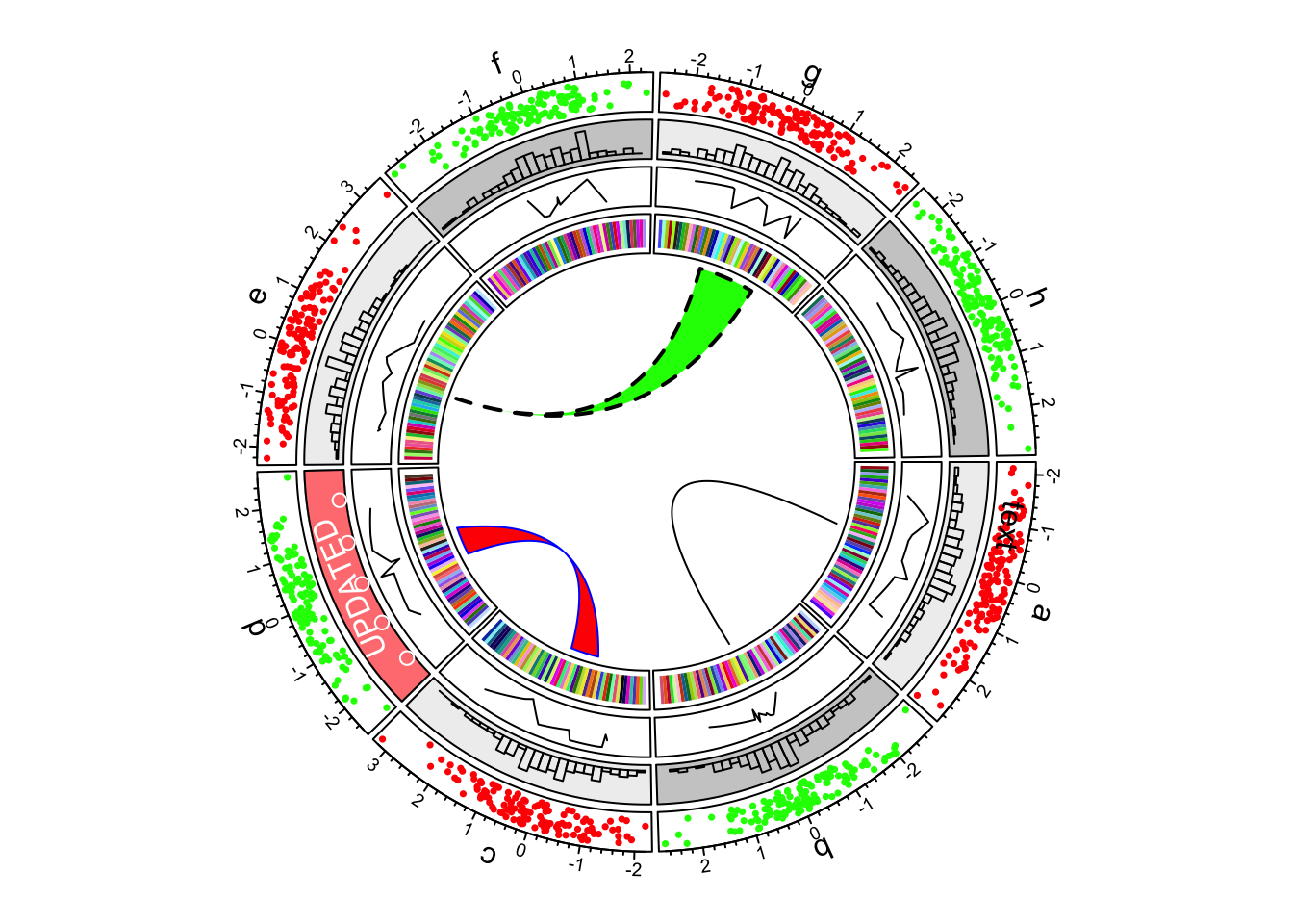
First example of circlize, add links.
8.Reset
Finally we need to reset the graphic parameters and internal variables, so that it will not mess up your next plot.
circos.clear()Genomic Data
circlize package particularly provides functions which focus on genomic plots. These functions are synonymous to the basic graphic functions but expect special format of input data:
| Function | Action |
|---|---|
circos.genomicTrack() |
create a new track and add graphics. |
circos.genomicPoints() |
low-level function, add points. |
circos.genomicLines() |
low-level function, add lines or segments. |
circos.genomicRect() |
low-level function, add rectangles. |
circos.genomicText() |
low-level function, add text. |
circos.genomicLink() |
add links. |
Input data
Genomic data is usually stored as BED format.
circlize provides a simple function
generateRandomBed() which generates random genomic
data.
In the function, nr and nc control the
number of rows and numeric columns that users need. Please note
nr are not exactly the same as the number of rows which are
returned by the function. fun argument is a self-defined
function to generate random values.
set.seed(999)
bed = generateRandomBed(nr = 200, nc = 4)
head(bed)
## chr start end value1 value2 value3 value4
## 1 chr1 2660551 16303823 0.5402657 -0.01736319 -0.57347883 0.49264928
## 2 chr1 22482472 25730719 -0.1234061 -0.05833207 -0.70408976 -0.61428666
## 3 chr1 26350059 37256898 -1.0568685 -0.32249104 -0.14116436 0.04261233
## 4 chr1 39575364 51959170 -0.1852637 0.87220580 -0.20888501 -0.60204692
## 5 chr1 58315212 60462404 0.2614339 0.18304724 0.49833176 -0.18842388
## 6 chr1 67739286 78935415 0.2589028 -0.03340496 -0.05314289 0.68182429Initialize with cytoband data
Cytoband data is an ideal data source to initialize genomic plots. It contains length of chromosomes as well as so called “chromosome band” annotation to help to identify positions on chromosomes.
If you work on human genome, the most straightforward way is to
directly use circos.initializeWithIdeogram() .
circos.initializeWithIdeogram()
text(0, 0, "default", cex = 1)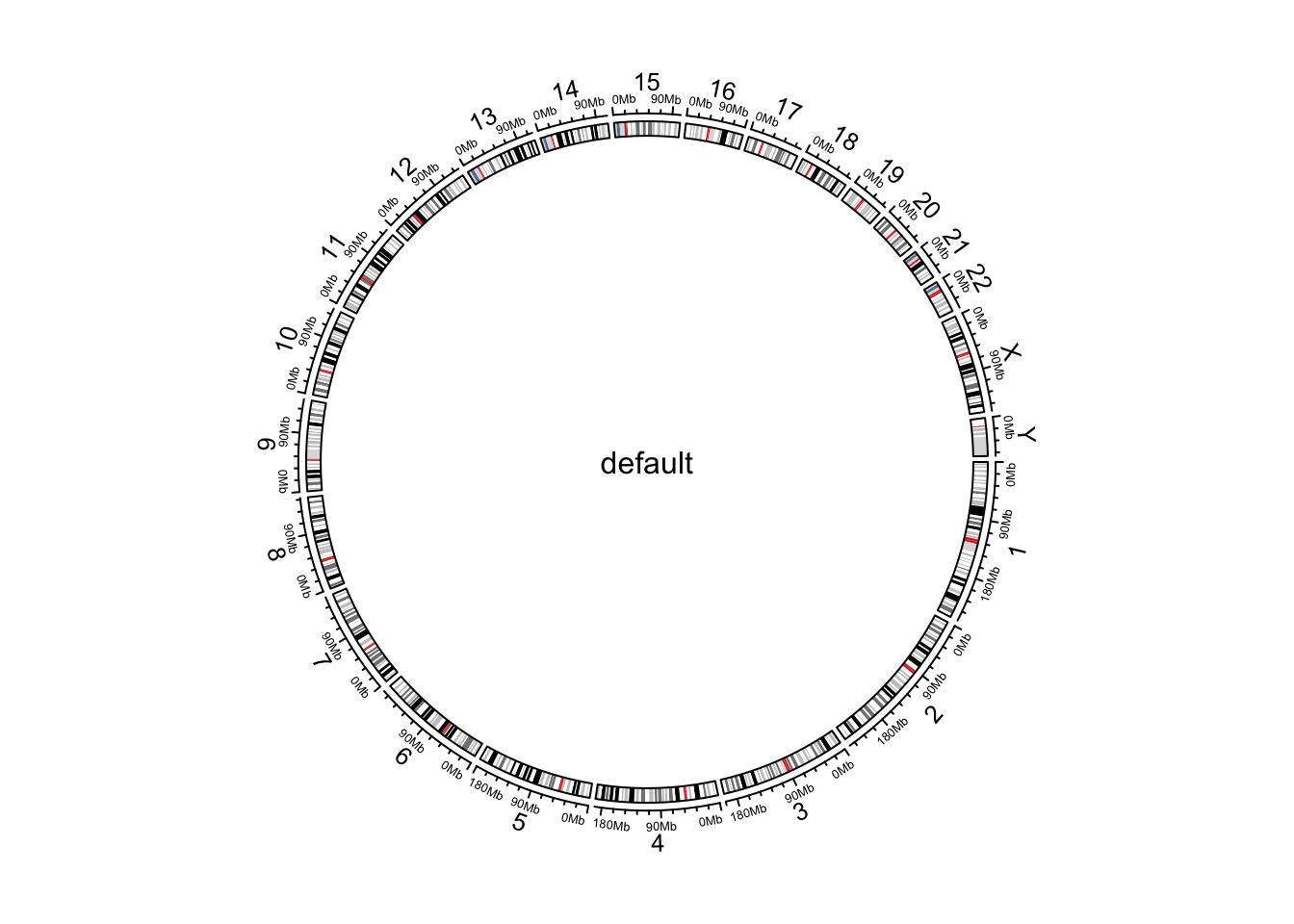
Initialize genomic plot, default.
circos.info()## All your sectors:
## [1] "chr1" "chr2" "chr3" "chr4" "chr5" "chr6" "chr7" "chr8" "chr9"
## [10] "chr10" "chr11" "chr12" "chr13" "chr14" "chr15" "chr16" "chr17" "chr18"
## [19] "chr19" "chr20" "chr21" "chr22" "chrX" "chrY"
##
## All your tracks:
## [1] 1 2
##
## Your current sector.index is chrY
## Your current track.index is 2circos.clear()By default, circos.initializeWithIdeogram() initializes
the plot with cytoband data of human genome hg19. Users can
also initialize with other species by specifying species
argument and it will automatically download cytoband files for
corresponding species.
circos.initializeWithIdeogram(species = "hg19")
circos.initializeWithIdeogram(species = "mm10")
When you are dealing rare species and there is no cytoband data
available yet, circos.initializeWithIdeogram() will try to
continue to download the “chromInfo” file form UCSC, which also contains
lengths of chromosomes, but of course, there is no ideogram track on the
plot.
In some cases, when there is no internet connection for downloading
or there is no corresponding data avaiable on UCSC yet. You can manually
construct a data frame which contains ranges of chromosomes or a file
path if it is stored in a file, and sent to
circos.initializeWithIdeogram().
cytoband.file = system.file(package = "circlize", "extdata", "cytoBand.txt")
circos.initializeWithIdeogram(cytoband.file)

cytoband.df = read.table(cytoband.file, colClasses = c("character", "numeric",
    "numeric", "character", "character"), sep = "\t")

str(cytoband.df)
circos.initializeWithIdeogram(cytoband.df)
If you read cytoband data directly from file, please explicitly
specify colClasses arguments and set the class of position
columns as numeric. The reason is since positions are
represented as integers, read.table would treat those
numbers as integer by default. In initialization of
circular plot, circlize needs to calculate the
summation of all chromosome lengths. The summation of such large
integers would throw error of integer overflow.
By default, circos.intializeWithIdeogram() uses all
chromosomes which are available in cytoband data to initialize the
circular plot. Users can choose a subset of chromosomes by specifying
chromosome.index. This argument is also for ordering
chromosomes (Figure @ref(fig:genomic-initialize-ideogram-subset)).
circos.initializeWithIdeogram(chromosome.index = paste0("chr", c(3,5,2,8)))
text(0, 0, "subset of chromosomes", cex = 1)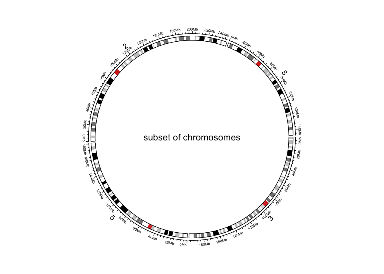
Initialize genomic plot, subset chromosomes.
circos.clear()When there is no cytoband data for the specified species, and when
chromInfo data is used instead, there may be many many extra short
contigs. chromosome.index can also be useful to remove
unnecessary contigs.
Pre-defined tracks
After the initialization of the circular plot,
circos.initializeWithIdeogram() additionally creates a
track where there are genomic axes and chromosome names, and create
another track where there is an ideogram (depends on whether cytoband
data is available). plotType argument is used to control
which type of tracks to add.
circos.initializeWithIdeogram(plotType = c("axis", "labels"))
text(0, 0, "plotType = c('axis', 'labels')", cex = 1)
circos.clear()

circos.initializeWithIdeogram(plotType = NULL)
text(0, 0, "plotType = NULL", cex = 1)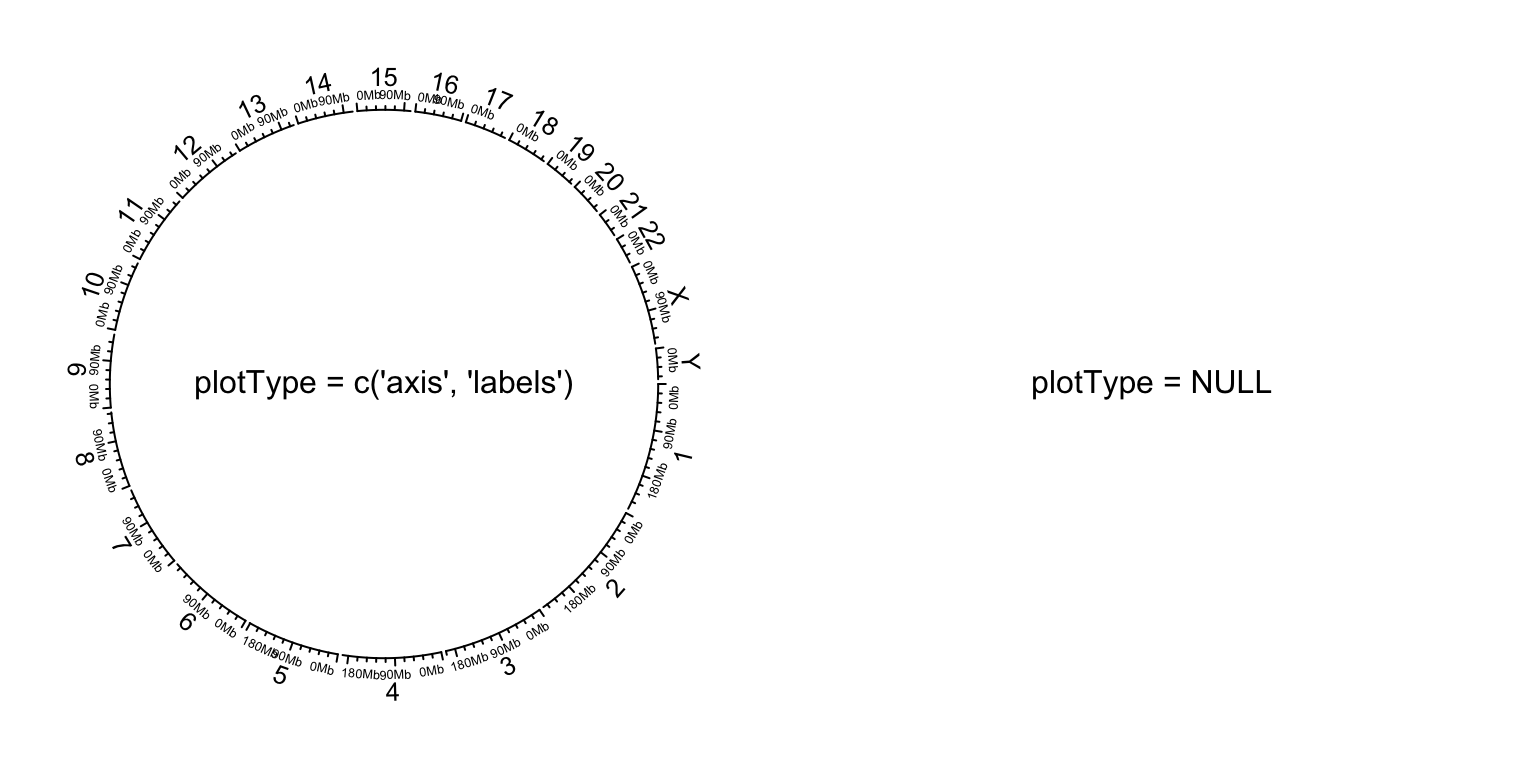
Initialize genomic plot, control tracks.
circos.clear()Other general settings
Similar as general circular plot, the parameters for the layout can
be controlled by circos.par(). Do remember when you
explicitly set circos.par(), you need to call
circos.clear() to finish the plotting.
circos.par("start.degree" = 90)
circos.initializeWithIdeogram()
circos.clear()
text(0, 0, "'start.degree' = 90", cex = 1)

circos.par("gap.degree" = rep(c(2, 4), 12))
circos.initializeWithIdeogram()
circos.clear()
text(0, 0, "'gap.degree' = rep(c(2, 4), 12)", cex = 1)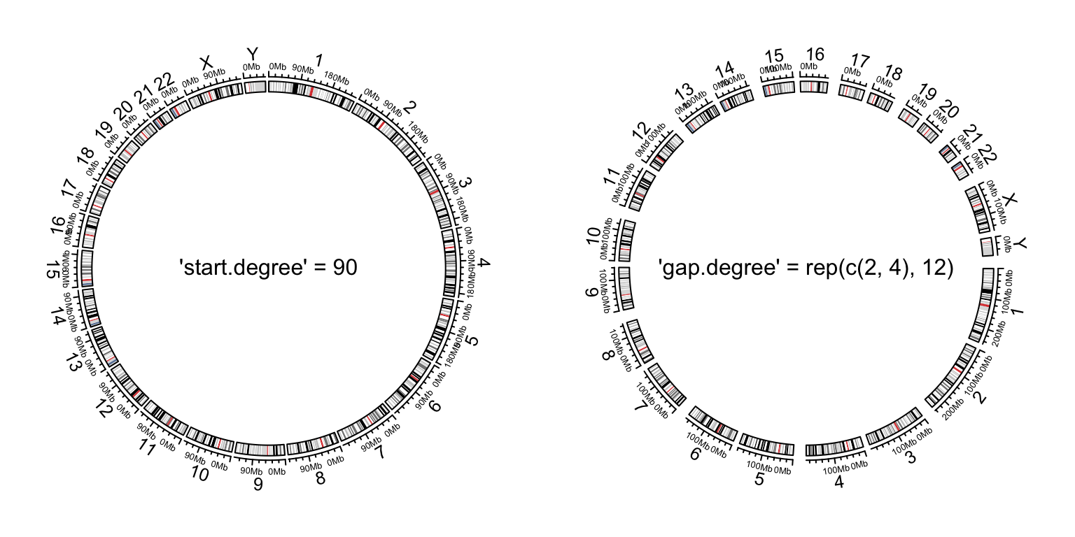
Initialize genomic plot, control layout.
Customize chromosome track
By default circos.initializeWithIdeogram() initializes
the layout and adds two tracks. When plotType argument is
set to NULL, the circular layout is only initialized but
nothing is added. This makes it possible for users to completely design
their own style of chromosome track.
In the following example, we use different colors to represent chromosomes and put chromosome names in the center of each cell.
set.seed(123)
circos.initializeWithIdeogram(plotType = NULL)
circos.track(ylim = c(0, 1), panel.fun = function(x, y) {
    chr = CELL_META$sector.index
    xlim = CELL_META$xlim
    ylim = CELL_META$ylim
    circos.rect(xlim[1], 0, xlim[2], 1, col = rand_color(1))
    circos.text(mean(xlim), mean(ylim), chr, cex = 0.7, col = "white",
        facing = "inside", niceFacing = TRUE)
}, track.height = 0.15, bg.border = NA)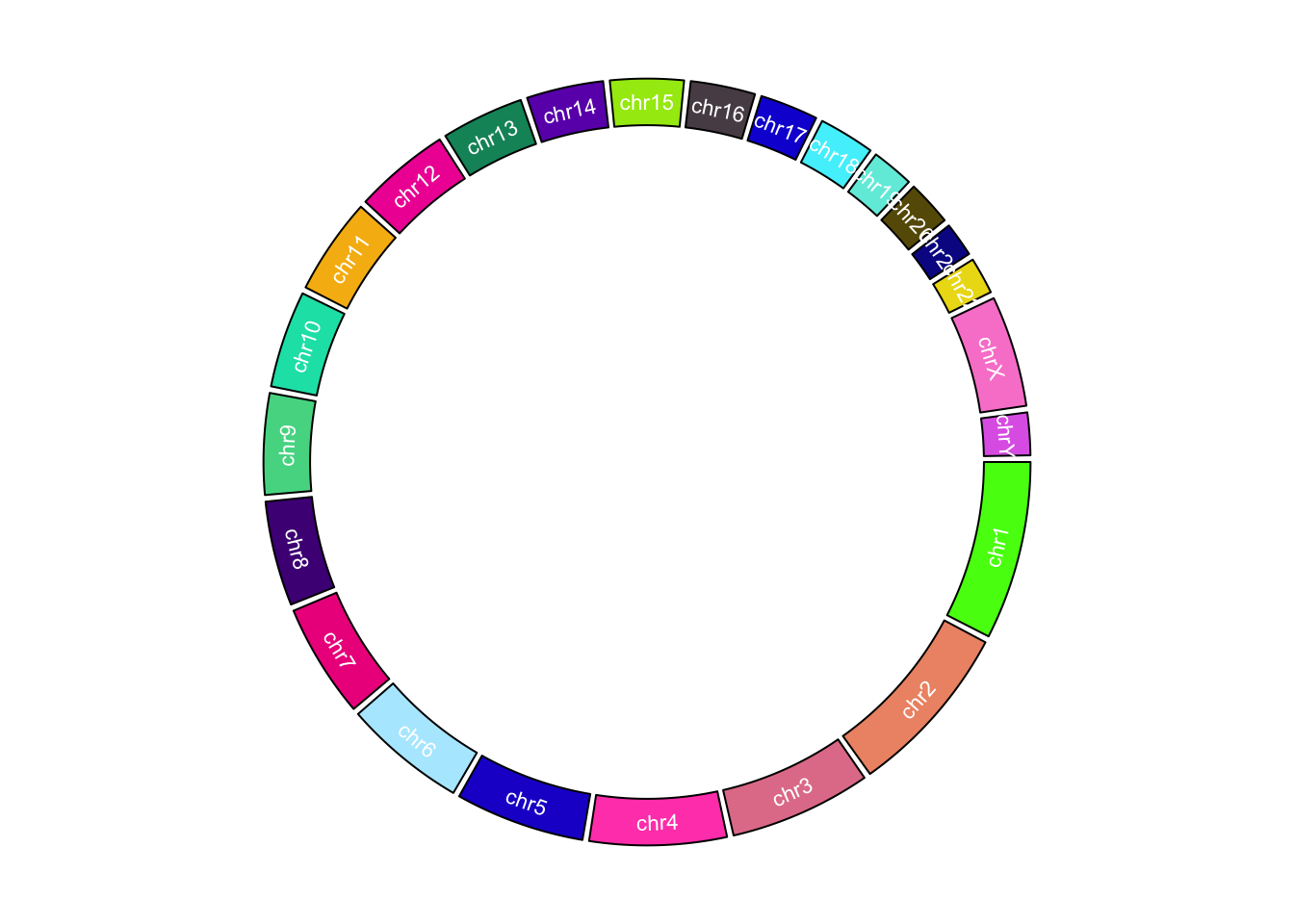
Customize chromosome track.
circos.clear()Initialize with general genomic category
Chromosome is just a special case of genomic category.
circos.genomicInitialize() can initialize circular layout
with any type of genomic categories. In fact,
circos.initializeWithIdeogram() is implemented by
circos.genomicInitialize(). The input data for
circos.genomicInitialize() is also a data frame with at
least three columns. The first column is genomic category (for cytoband
data, it is chromosome name), and the next two columns are positions in
each genomic category. The range in each category will be inferred as
the minimum position and the maximum position in corresponding
category.
In the following example, a circular plot is initialized with three genes.
df = data.frame(
    name  = c("TP53",  "TP63",    "TP73"),
    start = c(7565097, 189349205, 3569084),
    end   = c(7590856, 189615068, 3652765))
circos.genomicInitialize(df)
Note it is not necessary that the record for each gene is only one row.
In following example, we plot the transcripts for TP53, TP63 and TP73 in a circular layout.
tp_family = readRDS(system.file(package = "circlize", "extdata", "tp_family_df.rds"))
head(tp_family)
## gene start end transcript exon
## 1 TP53 7565097 7565332 ENST00000413465.2 7
## 2 TP53 7577499 7577608 ENST00000413465.2 6
## 3 TP53 7578177 7578289 ENST00000413465.2 5
## 4 TP53 7578371 7578554 ENST00000413465.2 4
## 5 TP53 7579312 7579590 ENST00000413465.2 3
## 6 TP53 7579700 7579721 ENST00000413465.2 2In the following code, we first create a track which identifies three genes.
circos.genomicInitialize(tp_family)
circos.track(ylim = c(0, 1),
    bg.col = c("#FF000040", "#00FF0040", "#0000FF40"),
    bg.border = NA, track.height = 0.05)
Next, we put transcripts one after the other for each gene. It is simply to add lines and rectangles.
n = max(tapply(tp_family$transcript, tp_family$gene, function(x) length(unique(x))))

circos.genomicTrack(tp_family
                    , ylim = c(0.5, n + 0.5)
                    , panel.fun = function(region, value, ...) {
                        all_tx = unique(value$transcript)
                        for(i in seq_along(all_tx)) {
                            l = value$transcript == all_tx[i]
                            # for each transcript
                            current_tx_start = min(region[l, 1])
                            current_tx_end = max(region[l, 2])
                            circos.lines(c(current_tx_start, current_tx_end),
                                c(n - i + 1, n - i + 1), col = "#CCCCCC")
                            circos.genomicRect(region[l, , drop = FALSE], ytop = n - i + 1 + 0.4,
                                ybottom = n - i + 1 - 0.4, col = "orange", border = NA)
                        }
                      }
                    , bg.border = NA, track.height = 0.4)
circos.clear()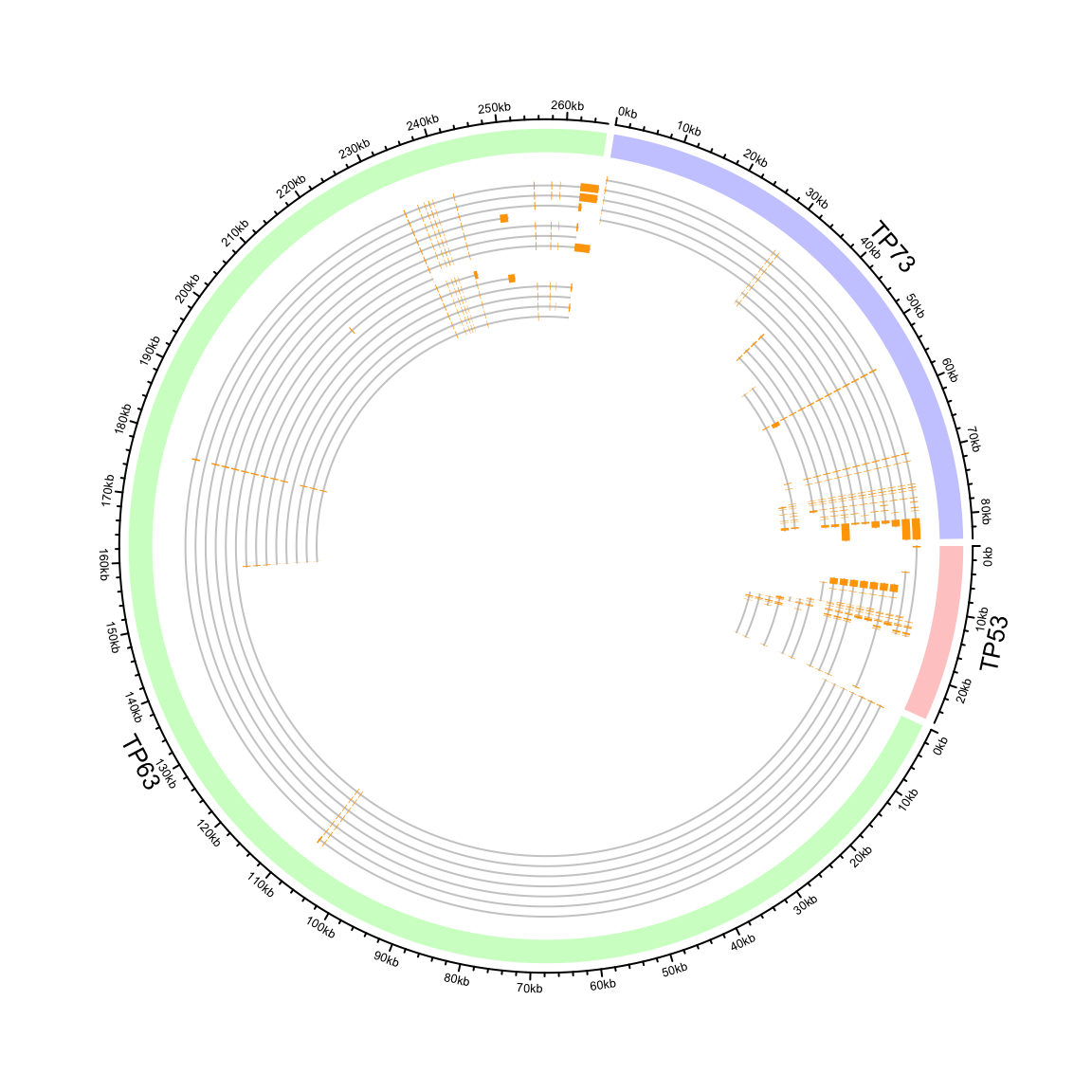
Circular representation of alternative transcripts for genes.
Zooming chromosomes
We first define a function extend_chromosomes() which
copy data in subset of chromosomes into the original data frame.
extend_chromosomes = function(bed, chromosome, prefix = "zoom_") {
    zoom_bed = bed[bed[[1]] %in% chromosome, , drop = FALSE]
    zoom_bed[[1]] = paste0(prefix, zoom_bed[[1]])
    rbind(bed, zoom_bed)
}
We use read.cytoband() to download and read cytoband
data from UCSC. In following, x ranges for normal chromosomes and zoomed
chromosomes are normalized separetely.
cytoband = read.cytoband()
cytoband_df = cytoband$df
chromosome = cytoband$chromosome

xrange = c(cytoband$chr.len, cytoband$chr.len[c("chr1", "chr2")])
normal_chr_index = 1:24
zoomed_chr_index = 25:26

# normalize in normal chromsomes and zoomed chromosomes separately
sector.width = c(xrange[normal_chr_index] / sum(xrange[normal_chr_index]),
                 xrange[zoomed_chr_index] / sum(xrange[zoomed_chr_index]))
The extended cytoband data which is in form of a data frame is sent
to circos.initializeWithIdeogram(). You can see the
ideograms for chromosome 1 and 2 are zoomed (Figure
@ref(fig:genomic-zoom)).
circos.par(start.degree = 90)
circos.initializeWithIdeogram(extend_chromosomes(cytoband_df, c("chr1", "chr2")),
    sector.width = sector.width)
Add a new track.
bed = generateRandomBed(500)
circos.genomicTrack(extend_chromosomes(bed, c("chr1", "chr2")),
    panel.fun = function(region, value, ...) {
        circos.genomicPoints(region, value, pch = 16, cex = 0.3)
})
Add a link from original chromosome to the zoomed chromosome (Figure @ref(fig:genomic-zoom)).
circos.link("chr1", get.cell.meta.data("cell.xlim", sector.index = "chr1"),
    "zoom_chr1", get.cell.meta.data("cell.xlim", sector.index = "zoom_chr1"),
    col = "#00000020", border = NA)
circos.clear()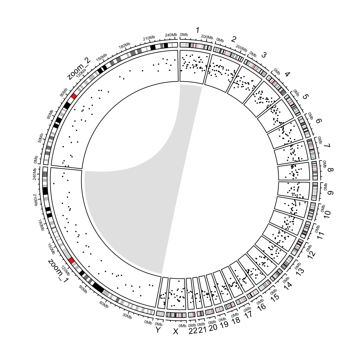
Zoom chromosomes.
A real world example:
I have a data frame with common features between 4 groups of patients and cell types. I have a lot of different features, but the shared ones (present in more than 1 group) are just a few.
I want to make a circos plot that reflects the few connections between shared features across groups of patients and cell types, while giving an idea of how many unshared features there are in each group.
The way I think of it, it should be a plot with 4 sectors (one for each group of patient and cell type) with a few connections between them. Each sector size should reflect the total number of features in the group, and most of this area should not be connected to other groups, but empty.
# Prepare the data  --------------------------------------------------------------

nonshared <- data.frame(patient=c(rep("Patient1",20), rep("Patient2",10)), cell.type=c(rep("CellType1",12), rep("CellType2",8),rep("CellType1",6), rep("CellType2",4)), feature=paste("a",1:30,sep=''))
sharedcells <- data.frame(patient=c(rep("Patient1",3), rep("Patient2",4)), cell.types=c(rep("CellType1||CellType2",3),rep("CellType1||CellType2",4)), features=c("b1||b1","b1||b1","b1||b1","b2||b2","b3||b3","b4||b4","b4||b5"))
sharedpats <- data.frame(patients=c(rep("Patient1||Patient2",2), rep("Patient1||Patient2",6)), cell.type=c(rep("CellType1",2),rep("CellType2",6)), features=c("c1||c1","c2||c1","c3||c3","c3||c4","c3||c5","c6||c5","c7||c7","c8||c8"))
sharedall1 <- data.frame(both=c(rep("Patient1-CellType1||Patient1-CellType2||Patient2-CellType1||Patient2-CellType2",4)), features=c("d1||d1||d1||d1","d2||d2||d2||d3","d4||d4||d3||d3","d5||d5||d5||d5"))
sharedall2 <- data.frame(both=c(rep("Patient1-CellType1||Patient1-CellType2||Patient2-CellType1",2)), features=c("d6||d6||d6","d7||d7||d7"))
sharedall3 <- data.frame(both="Patient1-CellType1||Patient1-CellType2||Patient2-CellType2", features="d8||d8||d9")
sharedall4 <- data.frame(both="Patient1-CellType1||Patient2-CellType1||Patient2-CellType2", features="d10||d10||d9")
sharedall5 <- data.frame(both=c(rep("Patient1-CellType2||Patient2-CellType1||Patient2-CellType2",3)), features=c("d11||d11||d11","d12||d13||d13","d12||d14||d14"))
sharedall6 <- data.frame()
sharedall7 <- data.frame(both=c(rep("Patient1-CellType2||Patient2-CellType1",2)), features=c("d15||d16","d17||d17"))
sharedall <- rbind(sharedall1, sharedall2, sharedall3, sharedall4, sharedall5, sharedall6, sharedall7)


knitr::kable(
  nonshared,
  caption = "Patient, cell type and feature"
)| patient | cell.type | feature |
|---|---|---|
| Patient1 | CellType1 | a1 |
| Patient1 | CellType1 | a2 |
| Patient1 | CellType1 | a3 |
| Patient1 | CellType1 | a4 |
| Patient1 | CellType1 | a5 |
| Patient1 | CellType1 | a6 |
| Patient1 | CellType1 | a7 |
| Patient1 | CellType1 | a8 |
| Patient1 | CellType1 | a9 |
| Patient1 | CellType1 | a10 |
| Patient1 | CellType1 | a11 |
| Patient1 | CellType1 | a12 |
| Patient1 | CellType2 | a13 |
| Patient1 | CellType2 | a14 |
| Patient1 | CellType2 | a15 |
| Patient1 | CellType2 | a16 |
| Patient1 | CellType2 | a17 |
| Patient1 | CellType2 | a18 |
| Patient1 | CellType2 | a19 |
| Patient1 | CellType2 | a20 |
| Patient2 | CellType1 | a21 |
| Patient2 | CellType1 | a22 |
| Patient2 | CellType1 | a23 |
| Patient2 | CellType1 | a24 |
| Patient2 | CellType1 | a25 |
| Patient2 | CellType1 | a26 |
| Patient2 | CellType2 | a27 |
| Patient2 | CellType2 | a28 |
| Patient2 | CellType2 | a29 |
| Patient2 | CellType2 | a30 |
Start
# library(circlize)
library(data.table)
library(magrittr)
library(stringr)
library(RColorBrewer)

# Split and pad with 0 ----------------------------------------------------
fun <- function(x) unlist(tstrsplit(x, split = '||', fixed = TRUE))

nonshared %>% setDT()
sharedcells %>% setDT()
sharedpats %>% setDT()
sharedall %>% setDT()

nonshared <- nonshared[, .(group = paste(patient, cell.type, sep = '-'), feature)][, feature := paste0('a', str_pad(str_extract(feature, '[0-9]+'), 2, 'left', '0'))]
sharedcells <- sharedcells[, lapply(.SD, fun), by = 1:nrow(sharedcells)][, .(group = paste(patient, cell.types, sep = '-'), feature = features)][, feature := paste0('b', str_pad(str_extract(feature, '[0-9]+'), 2, 'left', '0'))]
sharedpats <- sharedpats[, lapply(.SD, fun), by = 1:nrow(sharedpats)][, .(group = paste(patients, cell.type, sep = '-'), feature = features)][, feature := paste0('c', str_pad(str_extract(feature, '[0-9]+'), 2, 'left', '0'))]
sharedall <- sharedall[, lapply(.SD, fun), by = 1:nrow(sharedall)][, .(group = both, feature = features)][, feature := paste0('d', str_pad(str_extract(feature, '[0-9]+'), 2, 'left', '0'))]

dt_split <- rbindlist(
  list(
    nonshared,
    sharedcells,
    sharedpats,
    sharedall
  )
)

# Set key and self join to find shared features ---------------------------
setkey(dt_split, feature)
dt_join <- dt_split[dt_split, .(group, i.group, feature), allow.cartesian = TRUE] %>%
  .[group != i.group, ]

# Create a "sorted key" ---------------------------------------------------
# key := paste(sort(.SD)...
# To leave only unique combinations of groups and features
dt_join <-
  dt_join[,
          key := paste(sort(.SD), collapse = '|'),
          by = 1:nrow(dt_join),
          .SDcols = c('group', 'i.group')
          ] %>%
  setorder(feature, key) %>%
  unique(by = c('key', 'feature')) %>%
  .[, .(
    group_from = i.group,
    group_to = group,
    feature = feature)]

# Rename and key ----------------------------------------------------------

dt_split %>% setnames(old = 'group', new = 'group_from') %>% setkey(group_from, feature)
dt_join %>% setkey(group_from, feature)


# Individual features -----------------------------------------------------

# Features without connections --------------------------------------------

dt_singles <- dt_split[, .(group_from, group_to = group_from, feature)] %>%
  .[, N := .N, by = feature] %>%
  .[!(N > 1 & group_from == group_to), !c('N')]

# Bind all, add some columns etc. -----------------------------------------

dt_bind <- rbind(dt_singles, dt_join) %>% setorder(group_from, feature, group_to)

dt_bind[, ':='(
  group_from_f = paste(group_from, feature, sep = '.'),
  group_to_f = paste(group_to, feature, sep = '.'))]
dt_bind[, feature := NULL]  # feature can be removed

# Colour
dt_bind[, colour := ifelse(group_from_f == group_to_f, "#FFFFFF00", '#00000050')]  # Change first to #FF0000FF to show red blobs

# Prep. sectors -----------------------------------------------------------

sectors_f <- union(dt_bind[, group_from_f], dt_bind[, group_to_f]) %>% sort()

colour_lookup <-
  union(dt_bind[, group_from], dt_bind[, group_to]) %>% sort() %>%
  structure(seq_along(.) + 1, names = .)
sector_colours <- str_replace_all(sectors_f, '.[a-d][0-9]+', '') %>%
  colour_lookup[.]

# Gaps between sectors ----------------------------------------------------

gap_sizes <- c(0.0, 1.0)
gap_degree <-
  sapply(table(names(sector_colours)), function(i) c(rep(gap_sizes[1], i-1), gap_sizes[2])) %>%
  unlist() %>% unname()
# gap_degree <- rep(0, length(sectors_f))  # Or no gap
Plot!
# Each "sector" is a separate patient/cell/feature combination

circos.par(gap.degree = gap_degree)
circos.initialize(sectors_f, xlim = c(0, 1))
circos.trackPlotRegion(ylim = c(0, 1), track.height = 0.05, bg.col = sector_colours, bg.border = NA)

for(i in 1:nrow(dt_bind)) {
  row_i <- dt_bind[i, ]
  circos.link(
    row_i[['group_from_f']], c(0, 1),
    row_i[['group_to_f']], c(0, 1),
    border = NA, col = row_i[['colour']]
  )
}

# "Feature" labels
circos.trackPlotRegion(track.index = 2, ylim = c(0, 1), panel.fun = function(x, y) {
  sector.index = get.cell.meta.data("sector.index")
  circos.text(0.5, 0.25, sector.index, col = "white", cex = 0.6, facing = "clockwise", niceFacing = TRUE)
}, bg.border = NA)

# "Patient/cell" labels
for(s in names(colour_lookup)) {
  sectors <- sectors_f %>% { .[str_detect(., s)] }
  highlight.sector(
    sector.index = sectors, track.index = 1, col = colour_lookup[s],
    text = s, text.vjust = -1, niceFacing = TRUE)
}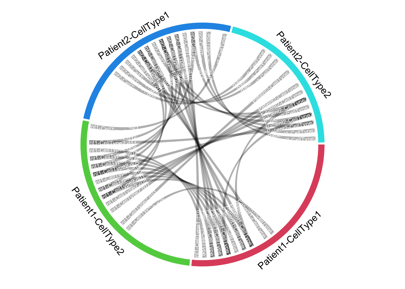
circos.clear()


# counts of unique and shared features ------------------------------------

xlims <- dt_split[, .N, by = group_from][, .(x_from = 0, x_to = N)] %>% as.matrix()
links <- dt_join[, .N, by = .(group_from, group_to)]
colours <- dt_split[, unique(group_from)] %>% structure(seq_along(.) + 1, names = .)

library(circlize)

sectors = names(colours)
circos.par(cell.padding = c(0, 0, 0, 0))
circos.initialize(sectors, xlim = xlims)
circos.trackPlotRegion(ylim = c(0, 1), track.height = 0.05, bg.col = colours, bg.border = NA)

for(i in 1:nrow(links)) {
  link <- links[i, ]
  circos.link(link[[1]], c(0, link[[3]]), link[[2]], c(0, link[[3]]), col = '#00000025', border = NA)
}

# "Patient/cell" labels
for(s in sectors) {
  highlight.sector(
    sector.index = s, track.index = 1, col = colours[s],
    text = s, text.vjust = -1, niceFacing = TRUE)
}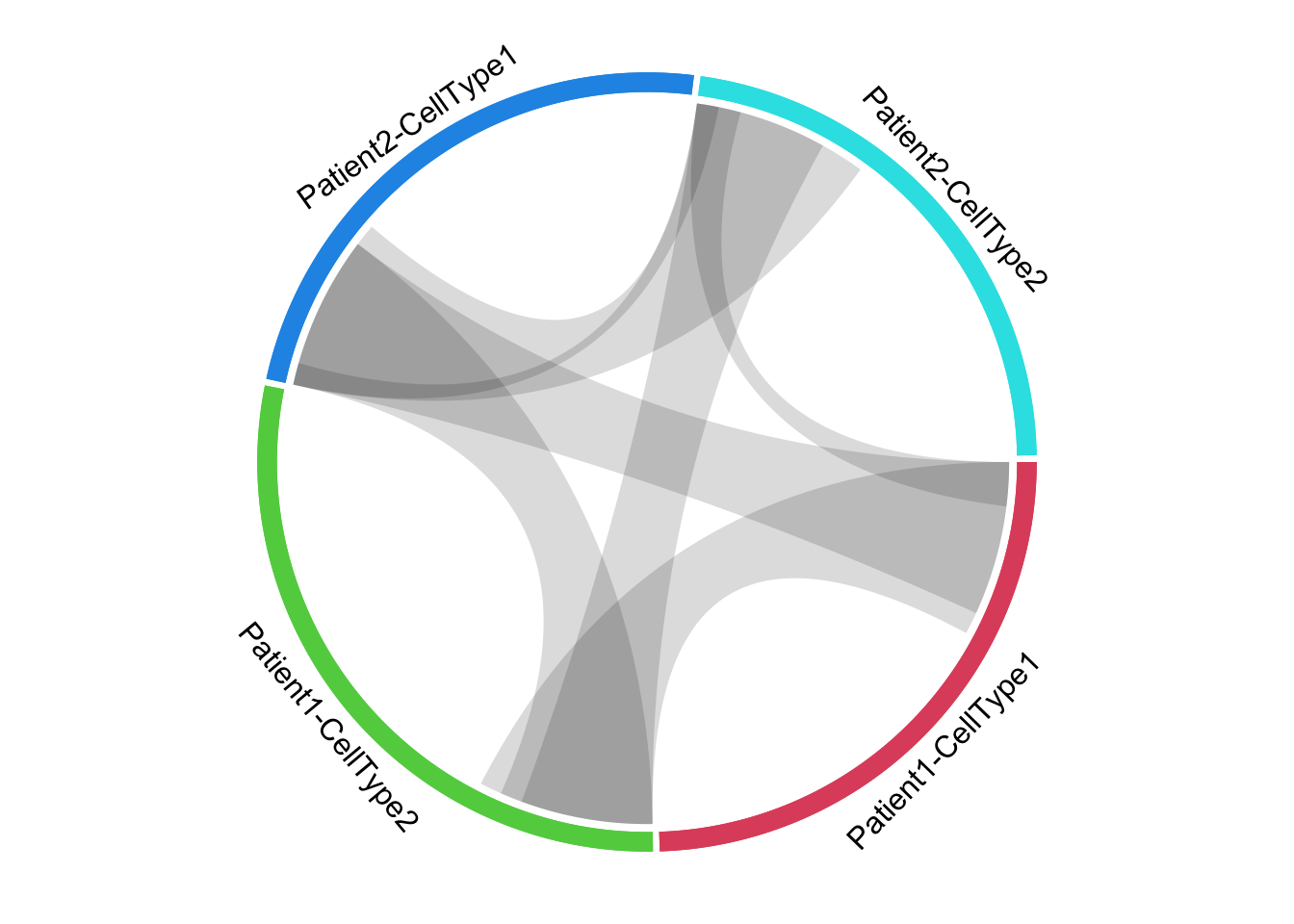
circos.clear()A work by Matteo Cereda and Fabio Iannelli